Building an accessible Modal component with React Portals: Part 2
Continuing our mission to build a Modal component that is accessible to all users, regardless of their current situation.
By Luke Whitehouse on
Last week I kick-started a short series on "Building an accessible Modal component with React Portals", based on my experiences in my day-to-day job at Sky and our open source CSS toolkit that I help maintain.
Within the first post we were able to utilise the newer features of ES6 and React such as Class Properties, React Portals and Fragments in order to build a Modal component that opens and closes using its respective buttons, but is only rendered on the page based on that.
This is part two of two in my series on Building an accessible Modal component with React Portals:
- Part 1: Styling and React integration
- Part 2: WAI ARIA attributes and focus management (this post)
Recapping
If you didn't read the previous post then I would urge you to do so with the link above. However, if you're following on from last week then here's what we have so far:
and here are the requirements we have for our component:
- ✅ When the Modal is not open, it is not rendered into the DOM.
- ✅ When rendered, the Modal is appended to the end of
document.body. - ❌ The Modal has relevant WAI-ARIA attributes in accordance with accessibility guidelines.
- ❌ Pressing the escape key will close the Modal.
- ❌ Clicking outside the Modal will close it.
- ❌ When open, scrolling is frozen on the main document beneath the Modal.
- ❌ When open, focus is drawn immediately to the Modal's close button.
- ❌ When the Modal closes, focus returns to the Modal's trigger button.
- ❌ Focus is trapped within the Modal when open.
As you can see,our component is coming along great and in this post we'll expand upon our work with the accessibility and focus management features essential in ensuring we have a Modal suitable for all users regardless of their circumstance.
WAI-ARIA Attributes
To start, we'll look at introducing the necessary WAI-ARIA attributes to our code so that screen readers and other devices can understand our component.
❌ The Modal has relevant WAI-ARIA attributes in accordance with accessibility guidelines.
If this is your first venture into the WAI-ARIA specification then I think this quote from a Stack Overflow thread sums them up pretty eloquently.
"WAI-ARIA stands for “Web Accessibility Initiative – Accessible Rich Internet Applications”. It is a set of attributes to help enhance the semantics of a website or web application to help assistive technologies, such as screen readers for the blind, make sense of certain things that are not native to HTML."
The key takeaway from this is right at the end, "make sense of certain things that are not native to HTML". Until we have a standard Modal HTML element, we need to ensure our fellow screen readers are able to understand our more complex components. Let's get cracking.
aria-modal
Within our ModalContent component, we'll start by adding the aria-modal attribute to .c-modal-cover.
<aside aria-modal="true" className="c-modal-cover">According to the WAI-ARIA spec, the aria-modal attribute indicates that not only is this component a modal element, but it explains that the user's interaction is limited to the contents of the element. Screen readers should then take this information to determine whether or not to set focus immediately to the element, depending on if focus has already been hijacked.
It's worth mentioning that aria-modal was only introduced into the ARIA 1.1 specification in November 2014 and so not all assistive devices will have support for it. If you require legacy support you can look at using aria-hidden instead.
In legacy dialog implementations where
aria-hiddenis used to make content outside a dialog inert for assistive technology users, it is important that:
- aria-hidden is set to true on each element containing a portion of the inert layer.
- The dialog element is not a descendant of any element that has aria-hidden set to true.
W3C's example implementation of the design pattern for modal dialogs.
tabindex
Moving on, let's talk tabindex. Technically not a WAI-ARIA attribute but I think it deserves to be grouped into this section as it's so tightly coupled with accessibility.
As with our aria-modal attribute, this can be added to .c-modal-cover. Just be mindful that tabindex should be referenced as tabIndex in React/JSX. Note the camelcase.
<aside
  className="c-modal-cover"
  aria-modal="true"
  tabIndex="-1"
>
The tabindex attribute allows you to indicate whether or not an element is supposed to be focusable by using tab and shift+tab keys in your browser to traverse the focus order (officially known as the sequential focus navigation), and if so, where it should appear in said order.
By setting our ModalContent to a negative value of tabindex="-1", we tell the browser that we do not want this to be ordered in the "sequential focus navigation" as we will be handling this ourselves using JavaScript.
"Sequential... Focus... what", you may be asking? Put another way, imagine we have a list of all focusable items on the page: maybe some navigation; links in our content area and sidebars and maybe some footer navigation. By setting a negative value of -1 to our tabindex we're taking our element out this list. You could liken it to how we use absolute positioning in CSS to take an element out of the document flow.
ARIA role
ARIA roles are next on the agenda. Similarly to aria-modal, the role attribute provides an element with additional semantic meaning to communicate to browsers their purpose. These days with the addition of HTML5 elements such as <article>, <main> and <nav> it's usually not a requirement to supply a role attribute as they're quite often covered by the HTML5 specification for those elements. However, in cases like a Modal where there isn't a specific HTML tag for this, we need to ensure our browser understands what we're building.
The exact role tag you should use differs depending on your requirements. Both dialog and alertdialog help the browser understand that the component's content is grouped independently and separate from the rest of the page's content, but there are more subtle differences between them.
99% of the time you'll be sticking with dialog. alertdialog should be used when the information you display requires the user's immediate attention. To give an example, you might use dialog when you're creating a popup to compose a new email, similarly to how Gmail looks. Whereas, you might use alertdialog when you're asking the user to confirm they'd like to delete their personal information from your website. That means you too, Zuckerberg.
Worth mentioning there are also differences between
alertdialogandalert.alertdialogshould only be used when you require the user's immediate attention to interact with something in your Modal. If there's nothing to interact with, thealertrole will be more appropriate. Mozilla have a guide on how to use thealertrole.
Now that we have the 'why' out of the way we can focus on the 'how'. Add the role attribute to the .c-modal-cover element within ModalContent.
<aside
  className="c-modal-cover"
  role={role}
  aria-modal="true"
  tabIndex="-1"
>
Pass role down as a prop, but give it a default value of dialog (thanks to ES6's Default parameters) as that's going to be used most of the time.
const ModalContent = ({
  onClose,
  role = 'dialog'
}) => {
Next, we need to pass that through to our Modal. Within Modal, add the role prop to our consumption of ModalContent.
<ModalContent
  onClose={this.onClose}
  role={role}
/>
This should then be destructured from our props, found above the component's return statement.
const { triggerText, role } = this.props;Here's how the Modal's full render method should look now.
render() {
  const { isOpen } = this.state;
  const { triggerText, role } = this.props;
  return (
    <Fragment>
      <ModalTrigger
        onOpen={this.onOpen}
        text={triggerText}
      />
      {isOpen &&
        <ModalContent
          onClose={this.onClose}
          role={role}
        />
      }
    </Fragment>
  );
}
This provides the flexibility of overriding the role as and when required, rather than having to reference role='dialog' every time you want to use the Modal in your app.
Now when consuming Modal you should be able to add the role prop which overrides the ModalContent's role attribute for the .c-modal-cover element.
aria-label vs aria-labelledby
With any dialog or alertdialog, you must provide a label to describe what the component is trying to achieve on the page. Over on MDN's "Using the dialog role" article, they describe a label's job similarly to that of a <legend> element and how it helps to group the controls within a <fieldset>.
The label given to the dialog will provide contextual information for the interactive controls inside the dialog. In other words, the dialog's label acts as a grouping label for the controls inside it.
There are two ways in which to label a Modal:
aria-labelaria-labelledby
When implemented, both work in exactly the same way for the browser, it's the implementations themselves that differ depending on what you're building. I really like how Nicholas C. Zakas explains which to use in his article from 2013 aptly titled 'Making an accessible dialog box'. Here's the example he gives:
// Example from Nicholas C. Zakas' article.
<div id="my-dialog" role="dialog" aria-label="New Message">
    <-- Your dialog code here -->
</div>

<div id="my-dialog" role="dialog" aria-labelledby="dialog-title">
    <h3 id="dialog-title">New Message</h3>
    <-- Your dialog code here -->
</div>
With aria-label you are able to create a completely new description for your dialog element, whereas aria-labelledby is used when you already have a title or some form of label element within your dialog that can be used to avoid duplication. In those cases, aria-labelledby accepts the id of the element you want to use as the label.
If you already have an element within your dialog component that fits this job description, then go with aria-labelledby as you won't have to duplicate content. If that's not the case, then you're better off sticking with aria-label. For this component, we'll be going with aria-label as we cannot guarantee the contents of our component as that's left to the user consuming it.
Back within ModalContent, add the aria-label attribute to .c-modal-cover.
<aside
  className="c-modal-cover"
  role={role}
  aria-label={ariaLabel}
  aria-modal="true"
  tabIndex="-1"
>
We will then expose this as a prop to be used when you consume ModalContent.
const ModalContent = ({
  ariaLabel,
  onClose,
  role = 'dialog'
}) => {
And then reference that prop where it is consumed within the Modal component itself.
render() {
  const { isOpen } = this.state;
  const { ariaLabel, triggerText, role } = this.props;
  return (
    <Fragment>
      <ModalTrigger
        onOpen={this.onOpen}
        text={triggerText}
      />
      {isOpen &&
        <ModalContent
          ariaLabel={ariaLabel}
          onClose={this.onClose}
          role={role}
        />
      }
    </Fragment>
  );
}
I'll then utilise this new prop where I consume <Modal />. As I mentioned before, you could add these props directly to the component as demonstrated below, or you could follow my preference of spreading through an object.
// Option 1:
const modalProps = {
ariaLabel: 'A label describing the Modal\'s current content',
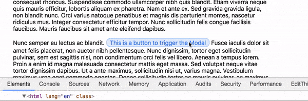
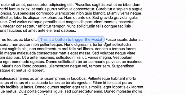
triggerText: 'This is a button to trigger the Modal'
};
<Modal {...modalProps} />
// Option 2:
<Modal
ariaLabel="A label describing the Modal's current content"
triggerText="This is a button to trigger the Modal"
/>For the rest of the tutorial I'll continue spreading an object.
Close button label
Going back to the notion of aria-label vs aria-labelledby, a great example of how using aria-labelledby makes sense can be found in our ModalContent's close button.
<button className="c-modal__close" aria-label="Close Modal" onClick={onClose}>
  <span className="u-hide-visually">Close</span>
  <svg className="c-modal__close-icon" viewBox="0 0 40 40"><path d="M 10,10 L 30,30 M 30,10 L 10,30"></path></svg>
</button>
You'll notice in our current markup we've got both a visually hidden span element and a aria-label attribute for our <button>. Both of which are trying to achieve the same thing. Rather than have both, we've got a decision to make:
- remove the visually hidden span and continue to update the label through
aria-label; - or update
aria-labelto bearia-labelledby.
Personally, I prefer the second approach as it keeps the content within HTML tags rather than within attributes but either approach is fine. If you'd like to do the same, add an id to the span.
<span id="close-modal" className="u-hide-visually">Close Modal</span>and update the aria-label attribute on the <button> to be aria-labelledby instead.
<button className="c-modal__close" aria-labelledby="close-modal" onClick={onClose}>
  <span id="close-modal" className="u-hide-visually">Close Modal</span>
  <svg className="c-modal__close-icon" viewBox="0 0 40 40"><path d="M 10,10 L 30,30 M 30,10 L 10,30"></path></svg>
</button>
Great, we should now have all the WAI-ARIA attributes our component requires. Just to recap we've:
- added
aria-modalto tell the browser that this component is a modal and when rendered, user interaction should be trapped within; - updated the component's
tabindexto tell the browser that we do not want this to be part of the "sequential focus navigation"; - setup a default
roleattribute ofdialogwith the option for users to override withalertdialogwhere required; - and finally we've added labels to our Modal via
aria-labelandaria-labelledby.
I think that deserves a tick.
✅ The Modal has relevant WAI-ARIA attributes in accordance with accessibility guidelines.
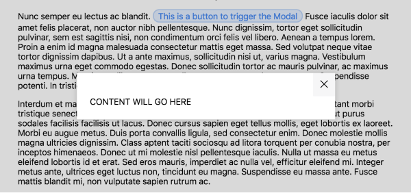
Adding children content
Now that we've handled the initial accessibility concerns of our component, we need to make the component useful. Currently, in ModalContent we're supplying some dummy content for demo purposes.
<div className="c-modal__body">
  CONTENT WILL GO HERE
</div>
What we really want is for the user to supply a their own content. Wherever you're consuming Modal in your App add some child content for the component to display.
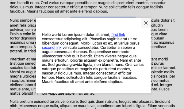
const modalContent = (
  <div>
    <p>Hello world Lorem ipsum dolor sit amet, <a href="#1">first link</a> consectetur adipiscing elit. Phasellus sagittis erat ut ex bibendum consequat. Morbi luctus ex ex, at varius purus <a href="#2">second link</a> vehicula consectetur. Curabitur a sapien a augue consequat rhoncus. Suspendisse commodo ullamcorper nibh quis blandit. Etiam viverra neque quis mauris efficitur, lobortis aliquam ex pharetra. Nam et ante ex. Sed gravida gravida ligula, non blandit nunc. Orci varius natoque penatibus et magnis dis parturient montes, nascetur ridiculus mus. Integer consectetur efficitur tempor. Nunc sollicitudin felis congue facilisis faucibus. Mauris faucibus sit amet ante eleifend dapibus.</p>
  </div>
);

const modalProps = {
  ariaLabel: 'A label describing the Modal\'s current content',
  triggerText: 'This is a button to trigger the Modal'
};

<Modal {...modalProps}>{modalContent}</Modal>
Again to keep things neat and tidy in JSX I prefer to create a variable to hold my content, but inline works too.
Once you've got some content, we need to display it. Within Modal pass through children from this.props as we've done with the other props.
const { ariaLabel, children, triggerText, role } = this.props;and pass the children down to a new prop for <ModalContent /> called content.
{isOpen &&
  <ModalContent
    ariaLabel={ariaLabel}
    content={children}
    onClose={this.onClose}
    role={role}
  />
}
Now we can get access to content within our ModalContent component.
const ModalContent = ({
  ariaLabel,
  content,
  onClose,
  role = 'dialog'
}) => {
and update our dummy content with our new content prop.
<div className="c-modal__body">{content}</div>Give that a whirl and you should see the component come to life with your new content.
Enhanced closing events
Our component's coming along swimmingly. We can open it, close it, provide it with some content to display and it can be understood by a whole manner for devices. However, we've still got some core pieces of functionality to get through.
One such piece is extending the ways we can close our Modal. At the moment that can only be done by clicking the close button in the top right of the component, however, if we check back at our checklist there are two methods we're still missing.
❌ Pressing the escape key will close the Modal.
❌ Clicking outside the Modal will close it.
Escape key
To start, we'll create the escape key event by utilising React's SyntheticEvent API which comes bundled with the framework.
Within ModalContent expose a new prop called onKeyDown.
const ModalContent = ({
  ariaLabel,
  content,
  onClose,
  onKeyDown,
  role = 'dialog'
}) => {
As we did with the onClose prop, we'll keep all the logic within our Modal. For now, add that prop as a value to the onKeyDown event handler on .c-modal-cover.
<aside
  className="c-modal-cover"
  role={role}
  aria-label={ariaLabel}
  aria-modal="true"
  tabIndex="-1"
  onKeyDown={onKeyDown}
>
Now within Modal, we'll create that onKeyDown method.
onKeyDown = (event) => {
  return event.keyCode === 27 && this.onClose();
}
As with normal JavaScript events, the React SyntheticEvent API exposes the event object, which we can use to find if the escape key was pressed via javascript key codes and call the onClose function we already have available.
We can even clean this up a little by destructuring keyCode from event and removing the curly braces to automatically return the result.
onKeyDown = ({ keyCode }) => keyCode === 27 && this.onClose();Now pass that function down to <ModalContent />...
{isOpen &&
  <ModalContent
    ariaLabel={ariaLabel}
    content={children}
    onClose={this.onClose}
    onKeyDown={this.onKeyDown}
    role={role}
  />
}
... and once you're focused on the ModalContent, you should be able to close the Modal by pressing the escape key.
✅ Pressing the escape key will close the Modal.
Clicking outside of the Modal
Now that we have the escape key working, we can focus (pun intended) our attention on the final use case for closing the modal – clicking outside of the component.
❌ Clicking outside the Modal will close it.
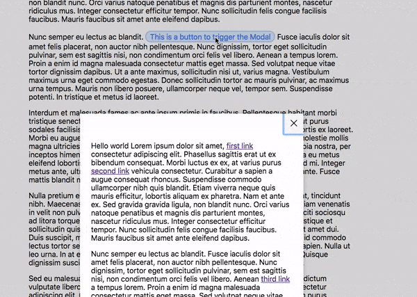
Due to the design of our component, the backdrop can only be seen on larger breakpoints, yet it's still a worthwhile addition to the component. To ensure there's no confusion, in the image below I've highlighted in blue the area which is considered "outside of the modal". That's to say, whenever you click on the backdrop, but not the Modal or the content a user supplies, the Modal should close.
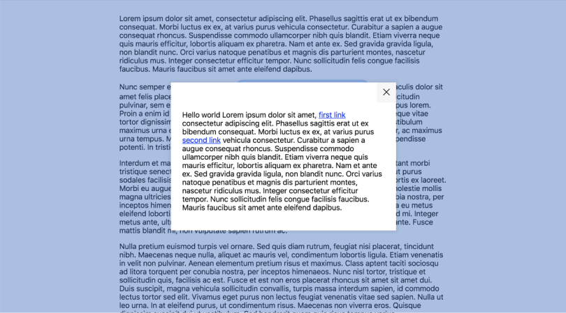
If you recall back to when we were styling up the component we have two HTML elements to represent this.
<aside className="c-modal-cover">
  <div className="c-modal">
  </div>
</aside>
In our structure, .c-modal represents the start of what we'd visually call the Modal, whereas .c-modal-cover is there to style up the backdrop. Based on this we can safely assume that we're on the backdrop when we're clicking within the .c-modal-cover but not within the .c-modal. This is the reason for requiring two HTML elements rather than one and allowing the backdrop to be styled via pseudo-elements.
We can translate this to React thanks to Refs which allow us to access children outside of the typical dataflow.
In this tutorial we're going to use a callback ref. However, with React 16.3, you can now use the new createRef API. Both can be used although I felt for this case a callback ref makes the most sense.
Within ModalContent, expose a new modalRef prop for us to use.
const ModalContent = ({
  ariaLabel,
  content,
  modalRef,
  onClose,
  onKeyDown,
  role = 'dialog'
}) => {
We can then assign that to the c-modal element using the ref attribute.
<div className="c-modal" ref={modalRef}>Now we need to use that reference in Modal.
{isOpen &&
  <ModalContent
    ariaLabel={ariaLabel}
    modalRef={n => this.modalNode = n}
    content={children}
    onClose={this.onClose}
    onKeyDown={this.onKeyDown}
    role={role}
  />
}
To break that down, a React callback ref allows you to supply a function with a single argument being the node you assigned the ref to, in our case c-modal. We can then assign this to a property of our Modal component named modalNode for later use via this.modalNode = n.
Now that we have a way to differentiate between the backdrop and the component itself we can go ahead and set up our backdrop clicking functionality.
Within ModalContent expose a new prop called onClickAway.
const ModalContent = ({
  ariaLabel,
  content,
  modalRef,
  onClickAway,
  onClose,
  onKeyDown,
  role = 'dialog'
}) => {
Then use that new prop as the value of a new onClick event handler on our c-modal-cover element.
<aside
  className="c-modal-cover"
  role={role}
  aria-label={ariaLabel}
  aria-modal="true"
  tabIndex="-1"
  onKeyDown={onKeyDown}
  onClick={onClickAway}
>
Now within Modal, create a new onClickAway method. Within which we'll check for if our newly created this.modalNode contains the node we clicked via event.target. If it does, we'll return and not do anything, however, if it doesn't we can once again call this.onClose.
onClickAway = (e) => {
  if (this.modalNode && this.modalNode.contains(e.target)) return;
  this.onClose();
};
Add this method to where we consume ModalContent and you should have the ability to click on the backdrop to close the Modal.
{isOpen &&
  <ModalContent
    ariaLabel={ariaLabel}
    modalRef={n => this.modalNode = n}
    content={children}
    onClickAway={this.onClickAway}
    onClose={this.onClose}
    onKeyDown={this.onKeyDown}
    role={role}
  />
}
✅ Clicking outside the Modal will close it.
Focused content
Now that we have our close events under wraps it's time to add some functionality to focus events for our component. First up, scroll locking.
Scroll locking
When our Modal is rendered to the screen we already know from our sections on accessibility that it should be the only thing a user can interact with.
Due to the default behaviour of the browser, if you open up the Modal and start scrolling, you'll see that the page scrolls even with the Modal being open. Whilst usually this isn't a problem, when dealing with anything that overlays the page the ideal experience would be that whilst the overlay is open, the rest of the page should be paused in its current state, then once you close said overlay the page is resumed and presented to the user in the exact same way they left it. The last thing we want is for a user to scroll the page whilst our Modal is open, then close the Modal and not know where they are because they've scrolled too far down the screen.
❌ When open, scrolling is frozen on the main document beneath the Modal.
To combat this we will remove the ability for the user to scroll the rest of the page when the Modal is open, and then reintroduce the functionality once the Modal is closed. Within our Modal, create a new method named toggleScrollLock. Within which we can toggle a class onto the html element of our page.
toggleScrollLock = () => document.querySelector('html').classList.toggle('u-lock-scroll');We can then extend onOpen and onClose methods to toggle this new class.
onOpen = () => {
  this.setState({ isOpen: true });
  this.toggleScrollLock();
};

onClose = () => {
  this.setState({ isOpen: false });
  this.toggleScrollLock();
};
Now that the toggleScrollLock is called on onOpen and onClose, anytime those methods are called, be it by a button or by a key event, the class u-lock-scroll will be toggled.
The only thing left to do now is to write a little CSS for our u-lock-scroll.
/**
* Lock the scroll position by adding this class to the `<html>` element.
*/
.u-lock-scroll {
  overflow: hidden !important;
}
The !important rule is optional. Whilst typically frowned upon in traditional CSS over the years, when working with the concept of a utility class whose styles should never be overridden, the rule gives us that reassurance of that being the case.
✅ When open, scrolling is frozen on the main document beneath the Modal.
Component focus
We're now on the home stretch. We've locked our scrolling so that when the component is rendered to the page the rest of the page is not interactive, now we need to finalise that by setting up our focus management.
Clearleft's Danielle Huntrods sums up our requirements for focus management pretty nicely.
Scripted focus management should therefore
- move the keyboard focus from the triggering element (link or button) to the custom dialog (or one of the focusable elements within it)
- keep it within the custom dialog until the dialog is closed (this makes the dialog effectively modal)
- move it back to the triggering element when the user closes the dialog by activating one of the choices offered.
Accessibility in modal dialogs, by Danielle Huntrods (2016)
Which brings us nicely to our last three criteria for our accessible Modal component:
- When open, focus is drawn immediately to the Modal's close button.
- When the Modal closes, focus returns to the Modal's trigger button.
- Focus is trapped within the Modal when open.
Opening focus
You may have noticed that currently if you open up the Modal you have to then click on the component in order to be able to use the escape key to close the Modal. This is because of where we've attached our escape key event to.
<aside
  className="c-modal-cover"
  role={role}
  aria-label={ariaLabel}
  aria-modal="true"
  tabIndex="-1"
  onKeyDown={onKeyDown}
  onClick={onClickAway}
>
By attaching the event to our .c-modal-cover element it will only trigger if it or one of its children are currently focussed which isn't the case when we first open the Modal. It'll still be set to the Modal's trigger button.
❌ When open, focus is drawn immediately to the Modal's close button.
To ensure our close button is automatically focussed when we open the Modal, we'll attach another React callback ref similar to that we did for this.modalNode. Within ModalContent, expose a new prop for buttonRef.
const ModalContent = ({
  ariaLabel,
  buttonRef,
  content,
  modalRef,
  onClickAway,
  onClose,
  onKeyDown,
  role = 'dialog'
}) => {
and then add that to the button via it's ref attribute.
<button className="c-modal__close" aria-labelledby="close-modal" onClick={onClose} ref={buttonRef}>Then within Modal, find where we consume ModalContent and using an arrow function assign the ref to a variable which we can use in a second.
{isOpen &&
  <ModalContent
    ariaLabel={ariaLabel}
    buttonRef={n => this.closeButtonNode = n}
    modalRef={n => this.modalNode = n}
    content={children}
    onClickAway={this.onClickAway}
    onClose={this.onClose}
    onKeyDown={this.onKeyDown}
    role={role}
  />
}
Finally, we can use our onOpen method within our Modal class to update the focus by leveraging the React setState method's second argument which allows you to supply a callback to be run once the state has been applied.
onOpen = () => {
  this.setState({ isOpen: true }, () => {
  });
  this.toggleScrollLock();
};
We can then use our new this.closeButtonNode variable to access our close button element and call the focus method provided by React's synthetic events.
onOpen = () => {
  this.setState({ isOpen: true }, () => {
    this.closeButtonNode.focus();
  });
  this.toggleScrollLock();
};
✅ When open, focus is drawn immediately to the Modal's close button.
Due to the component not being rendered unless the state is true, we need to make sure we only focus onto the close button after we set the state, otherwise, we're going to see some lovely errors explaining that we're trying to access a node that doesn't exist.
Closing focus
As with all things, there's a balance. Now that we've managed the focus when opening the Modal, we need to do the same when closing it too.
❌ When the Modal closes, focus returns to the Modal's trigger button.
Similarly to how we just dealt with the close button, we'll create a React callback ref for the Modal's trigger button which we'll then focus on when the Modal has been closed.
Open up the ModalTrigger class and expose a buttonRef prop.
const ModalTrigger = ({
  buttonRef,
  onOpen,
  text
})
We can then apply that prop to the ref attribute to the trigger's <button/> element.
const ModalTrigger = ({
  buttonRef,
  onOpen,
  text
}) => <button className="c-btn" onClick={onOpen} ref={buttonRef}>{text}</button>;
Back within the Modal class, find where we consume ModalTrigger and just as we did with the close button, use an arrow function to assign the ref to a variable.
<ModalTrigger
  onOpen={this.onOpen}
  buttonRef={n => this.openButtonNode = n}
  text={triggerText}
/>
We can then use this.openButtonNode within our onClose method to focus it when we close our Modal.
onClose = () => {
  this.setState({ isOpen: false });
  this.openButtonNode.focus();
  this.toggleScrollLock();
};
Notice that we don't put this one into the setState callback because our trigger button is always rendered, unless our close button.
✅ When the Modal closes, focus returns to the Modal's trigger button.
Give that a try in your browser and you should see the
Trap focus within Modal
Now that we have the initial setup of our focus management in the form of opening and closing, we need to ensure that whilst open, focus stays within the Modal.
❌ Focus is trapped within the Modal when open.
The WAI-ARIA Authoring Practices 1.1 guide explains that once a Modal component is open, a user should not be able to focus anything outside of it. In addition, when using the TAB and SHIFT + TAB elements to cycle through the sequential focus order, the user should be put into what we can call a "focus loop", where the browser will focus the next available target in the Modal but if there is no "next target" then it should cycle back to the last.
That took a bit to get my head around so if you're unsure then no worries we can learn through an example.
Currently, we have three targettable elements to be focused on within our Modal: the close button and the two links from our content. Thanks to our recent enhancements when we open the Modal focus will automatically be given to the close button. When the user then presses the TAB key, focus will be given to the first link. After which, the second link will be focussed. At this point there are no focusable elements after the second link, so focus must be given back to the first element which in our case is the close button.
On the flip side, if the Modal were to open (with focus automatically being given to the close button) and the SHIFT + TAB keys were to be pressed then right at the start there isn't an element before the close button, so focus must be given to the last element within the Modal which would be the second link. After which you'd do the same thing as above but backwards.
- Second link;
- first link;
- close button;
- second link;
- and so on so forth.
Whilst we could do this from scratch by getting a list of focussable targets within our Modal, its a lot easier when there's already an external package ready for us to use. focus-trap and it's React wrapper focus-trap-react are packages from David Clark and will help ensure we have everything we need to trap the focus within our Modal.
As a side note, David works on some great projects such as the crazy popular stylelint and a number of fully accessible components ready for you to use, including a Modal component which helped drive a lot of the direction for this tutorial. Go check him out!
To get started you'll want to install the npm package.
npm install focus-trap-reactNext, we'll look to update our ModalContent component to consume our new package. Within ModalContent replace the aside tag with FocusTrap.
<FocusTrap
  className="c-modal-cover"
  role={role}
  aria-label={ariaLabel}
  aria-modal="true"
  tabIndex="-1"
  onFocus={onFocus}
  onKeyDown={onKeyDown}
  onClick={onClickAway}
>
  <div className="c-modal" ref={modalRef}>
    <button className="c-modal__close" aria-labelledby="close-modal" onClick={onClose} ref={buttonRef}>
      <span id="close-modal" className="u-hide-visually">Close</span>
      <svg className="c-modal__close-icon" viewBox="0 0 40 40"><path d="M 10,10 L 30,30 M 30,10 L 10,30"></path></svg>
    </button>
    <div className="c-modal__body">{content}</div>
  </div>
</FocusTrap>
By default FocusTrap renders as a <div> tag. If we want to update that to an aside we can pass the tag prop to FocusTrap.
<FocusTrap
  tag="aside"
>
As a side effect of using ReactFocusTrap, it already comes with close functionality baked in when you click the escape key, so we can go ahead and remove our implementation.
Go ahead and remove the onKeyDown prop from ReactFocusTrap
<FocusTrap
  tag="aside"
  className="c-modal-cover"
  role={role}
  aria-label={ariaLabel}
  aria-modal="true"
  tabIndex="-1"
  onFocus={onFocus}
  onClick={onClickAway}
>
And do the same for the props coming through in the ModalContent component itself.
const ModalContent = ({
  ariaLabel,
  buttonRef,
  content,
  modalRef,
  onClickAway,
  onFocus,
  onClose,
  role = 'dialog'
}) => {
✅ Focus is trapped within the Modal when open.
Test that out in your browser and you should see focus is trapped within the Modal component when it's open.
Concluding thoughts
If you've got this far I commend you, we've covered a hell of a lot in this series. We've built a Modal component that is fully responsive and accessible for all users, in accordance with the W3C specifications for Accessible Rich Internet Applications.
Our component:
- is only rendered to the DOM when the Modal has been triggered;
- is appended to the end of the
document.body; - has the relevant WAI-ARIA attributes in accordance with accessibility guidelines;
- closes when the escape key has been pressed, thanks to ReactFocusTrap;
- closes when the user clicks on its backdrop;
- freezes scrolling on the main document when the Modal has been triggered;
- draws focus immediately to the Modal's close button when it has been triggered;
- draws focus immediately back to the Modal's trigger button after the user closes it;
- and finally, traps focus within it when triggered.
We've also looked into some of the newer features of React 16: React Portals and Fragments, not to mention dipping our toes into newer ECMAScript features such as Class Properties, default parameters and destructuring. My hope now is that you're able to take what you've learned in this series and expand upon the ideas in your own projects. I'd love to hear what you work on, let me know!
You can view the finished component over on Github
Now we just need to test this stuff...
Until next time