Introducing BEM: The popular CSS naming convention
Going over the fundamentals of the methodology that organisations large and small are using to structure their CSS codebases.
By Luke Whitehouse on
Over the last few years CSS architecture has taken a much larger role in Front-end development. Whether it be a startup of 3 developers or an enterprise product built up of multiple departments, the requirements of a scalable but easy to use codebase have grown exponentially, which as a result has seen the rise in many different conventions or practices detailing how to write your CSS. One particular methodology I’d like to talk to you about today is the "Block, Element, Modifier” naming convention, or BEM for short.
Built by Yandex, BEM has quickly grown in popularity to become one of the leading examples of how you can structure your CSS in a way that will benefit your organisation or website, but rather than get bogged down on why, I want focus on how. In this post I’ll look to demystify the methodology so you can start using it in your own websites.
The concept
BEM is a naming convention that aims to arm developers with an understanding of how one HTML tag relates to another in any given project. In theory, it makes it very easy for said developer to answer the following types of questions:
- "Is this heading element significant to the
<div>it's wrapped in, or just a coincidence?". - "Does this button always belong in the header?".
These are the things BEM can answer lightning fast, and when your codebase starts to grow or you inherit someone else's, you'll be thankful for it.
BEM (Block, Element, Modifier) is a component-based approach to web development. The idea behind it is to divide the user interface into independent blocks. This makes interface development easy and fast even with a complex UI, and it allows reuse of existing code without copying and pasting.
Quick start guide - en.bem.info
Thinking in terms of components on a page, here's how I break things down. BEM stands for Block, Element, Modifier:
- Block: This 'block' class is used to signify a component, or a standalone object on the page. Block classes are usually short nouns which define the component.
- Element: An element always lives within a block, it's a single part of a component that together with others, make up the block's features. Element classes are prefixed by the block's class, followed by double underscores. For example
.block__element. - Modifier: You may often find yourself repeating multiple components, or blocks that do very similar things but with slight alterations. Maybe Box 1 has a blue background whereas Box 2 has a red background. This is where modifiers come into play, adding an extra hook in our CSS to give that one specific block some extra bits of styling. Modifier classes are prefixed once again by the block's class, but followed this time by double hyphens, for example
.block--modifier. They can also be prefixed by the element class if the modifier is specifically modifying that, rather than the entire block, for example.block__element--modifier. I like to reference this as "Block Modifiers vs Element Modifiers".
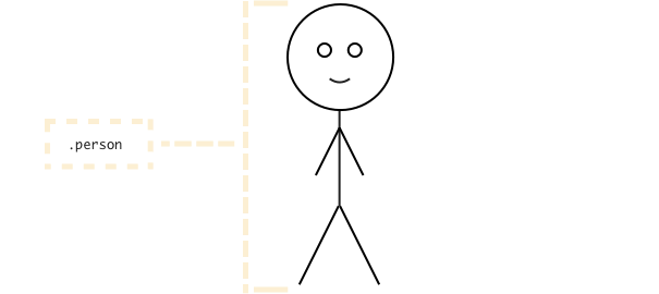
Whenever I'm explaining to someone how the BEM naming convention works I always fallback to a post from Harry Roberts in 2013 entitled "MindBEMding - getting your head 'round BEM syntax". Within this post, Harry uses the example of how we might structure a person in BEM, if it were a component on your website.
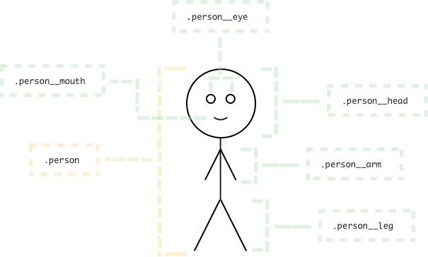
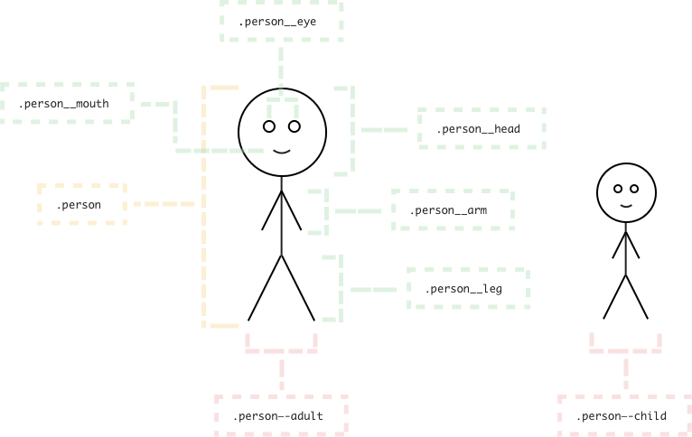
The block level element would be .person as that's the component we're creating. The elements of a person are his/her limbs, so .person__leg, .person__hand, which all belong to a person. Finally, modifiers of a person could be their sex (i.e. .person--female, .person--male) or maturity (i.e. .person--adult, .person--child). These classnames then provide developer's some up front knowledge about the relationship those classes have to one another, rather than having to guess from the CSS properties used.
More importantly, you can then start reusing components for different aspects of your page. Let's say you need to use a 'person' component twice on the page, once for an adult and another for a child. All people have hands, legs and feet so those classes and their styling don't need to change. The only difference is that there may be a few tweaks to these elements, based on the modifier of the component (in this case, the maturity of the person).
Here's how we might break things down. First, we start off with our .person block.
Next, we have the elements of our component (or 'block'). We then know that all .person__hand and .person__eye components are required to be nested within the .person block.
Finally, we modify the block where necessary, and we then know that the .person--adult class is always declared on a HTML tag with the .person block.
Real world examples
Enough of that theory stuff, let's think about some real world examples.
The button component
Also known as the .btn component, this is a staple in any interface design requiring call to actions for your users. What's unique about smaller components like these is that they typically don't have many elements, but have a lot of modifiers. Allow me to explain.
Let's take this website as an example. I have four colours in my palette: #efb5b5, #afdeb5, #aed7ea and #f8d892. If I were to use these as modifiers for my buttons I might do something like this.
/* Block */
.btn { /* styling here */ }

/* Modifiers */
.btn--red { background: #efb5b5; }
.btn--blue { background: #aed7ea; }
.btn--green { background: #afdeb5; }
.btn--yellow { background: #f8d892; }
And here's my markup.
<a href="#" class="btn btn--red">Text here</a>As you can see, there's no reason to add any elements to this component, unless I wanted some sort of icon next to the text perhaps.
<a href="#" class="btn btn--red">
<span class="btn__icon">←</span>
Text here
</a>A note on modifier naming
That looks great, but now I have modifiers that have very distinct purposes that can't change later down the line. Take .btn--red for example, it's very obvious that this class will always make the background red, and any deviation from that wouldn't make sense. So 6 months down the line when I decide I want to use purple for my brand instead of red, I would need to create a whole new class and deprecate the old one. Not a problem for a modifier as small as this, but it still means I need to go through my entire codebase and change any reference of .btn--red to .btn--purple, or similar. Now imagine a larger component with many options, things can quickly get away from us.
A better approach would be to keep classes unopinionated from the styling they're producing. Classes such as .btn--primary, .btn--secondary are far more universal to an ever changing brand and don't infer styling.
The media component
Nicola Sullivan wrote at length about the implementation of the .media element she helped Facebook with back in 2010. The general idea behind this component is that it's a common pattern that you'll see yourself using on many layouts. It's the idea of an image floated to the left of some text, here's an example of the component being used on the Smashing Magazine website, taken from my post on Why the DRY principle isn't always the right answer.
Our markup would look something like this.
<div class="media">
  <img class="media__img" src="" alt="">
  <div class="media__body">
    <!-- Content goes here -->
  </div>
</div>
And our CSS would introduce the .media--flipped modifer, where you are able to override the default nature of the component and have the image appear to the right of the text.
/* Block */
.media {}

/* Elements */
.media__body {}
.media__img {}

/* Modifiers */
.media--flipped {}
Further reading
I hope this brief primer on the BEM methodology has helped, but if you're still unsure I would recommend looking over the following articles:
- BEM: A New Front-End Methodology by Varvara Stepanova for Smashing Magazine (2012)
- "MindBEMding - getting your head 'round BEM syntax" by Harry Roberts (2013)
- BEM 101 by Robin Rendle for CSS-Tricks (2015)
- Battling BEM CSS: 10 Common Problems And How To Avoid Them by David Berner for Smashing Magazine (2016)
- BEM resources - a big list of lists by Stu Robson.
Anything to add? Something i could have explained a little better? Let me know in the comments section below.
Until next time