Building an accessible Modal component with React Portals: Part 1
Understanding how to build a reusable Modal component using the latest features from React and ES6 that's accessible for all users.
By Luke Whitehouse on
The elusive Modal component is a staple in any website's arsenal but is still one of the more complex components to build, especially when considering the accessibility requirements. Recently, as part of my role as a Front-end developer at Sky, I helped create one in our open source CSS toolkit, where I learned a lot about what it takes to cater for all users, regardless of their situation.
Within this short series I'll take you through my discoveries whilst building out a brand new component based on that work, using some of the newer features in ES6 and React 16 along the way.
This is part one of two in my series on Building an accessible Modal component with React Portals:
- Part 1: Styling and React integration (this post)
- Part 2: WAI ARIA attributes and focus management
Setting the stage
Here's what we're building.
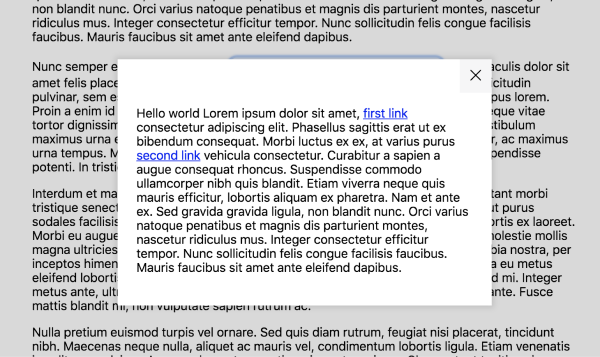
A rather simple, yet extensible design for a Modal component which bleeds to the edges of the screen on smaller breakpoints; but centres in the middle of the screen at larger breakpoints; with a backdrop for the rest of the page.
Accessibility
For the accessibility and general requirements of a Modal, we've got quite a few that our component will need to adhere to:
- When the Modal is not open, it is not rendered into the DOM.
- When rendered, the Modal is appended to the end of
document.body. - The Modal has relevant WAI-ARIA attributes in accordance with accessibility guidelines.
- Pressing the escape key will close the Modal.
- Clicking outside the Modal will close it.
- When open, scrolling is frozen on the main document beneath the Modal.
- When open, focus is drawn immediately to the Modal's close button.
- When the Modal closes, focus returns to the Modal's trigger button.
- Focus is trapped within the Modal when open.
Consumability
There's something to also be said for the consumability of the component. A Modal can be separated into two parts: it's trigger, the thing that opens it; and the content area that is made visible once you've clicked on said trigger.
We're going to want a consumer-friendly API that requires the developer to only have to interact with our component once. If we know from our guidelines above that we always want the Modal to be rendered at the end of the document.body, then the logical place for the user to interact with the API would be wherever he/she would like to place the trigger.
Granted, there's a lot to cover, but stick with me and I'll take you through it one step at a time.
Creating a base
Rather than reinventing the wheel for this tutorial, I'll be using Facebook's create-react-app, however, feel free to use whatever you'd like. Just ensure that you can get setup with Sass preprocessing and a ES6 module transpiler like Babel.
Once you have a project ready to rumble, we'll get started by creating a page component with some dummy content.
import React from 'react';

const App = () => {
  return (
    <main className="content">
      <p>Lorem ipsum paragraph...</p>
      <p>Lorem ipsum paragraph...</p>
      <p>Lorem ipsum paragraph...</p>
    </main>
  );
}
This is where we'll eventually initialise our Modal in order to demonstrate consuming it in a real application. For now, render our page component onto the page with the react-dom package.
import React from 'react';
import ReactDOM from 'react-dom';

ReactDOM.render(<App />, document.getElementById('root'));
We'll also want to give our page some basic styling. To do so, we're going to build on top of the ever-popular Normalize.css with some overrides of our own, so make sure you include Normalize in your CSS first.
// Import Normalize before our styles

html {
  font-family: -apple-system, BlinkMacSystemFont, Helvetica, Arial, sans-serif;
  box-sizing: border-box;
}

*,
*:before,
*:after {
  box-sizing: inherit;
}

.content {
  width: 95%;
  max-width: 700px;
  margin: 2em auto;
}
Nothing too crazy to note here, we're setting some box-sizing defaults to help us deal with the CSS box model going forward and centring our content into the middle of the page to make it easier on the eye.
Now it's time to start creating our Modal component. We'll use ES6 classes to extend React.Component from react as we'll be setting this up to eventually be a stateful component later on in this post.
import React from 'react';

class Modal extends React.Component {
  render() {
    return (
      <button>This is a button to trigger the Modal</button>
    );
  }
}
Note: If you're looking to use this in a production environment I'd recommend destructuring
React.Componentfrom the React import.import React, { Component } from 'react';This will allow you to benefit from Tree Shaking should you set it up in your build tools. Webpack have a great guide on the topic.
Now use your newfangled <Modal /> component in your App and you should see the Modal trigger button. Make sure to add some dummy content to the app to show how the trigger might look inline with some semblance of a real world application.
const App = () => {
  return (
    <main className="content">
      <p>Lorem ipsum paragraph <Modal />...</p>
      <p>Lorem ipsum paragraph...</p>
      <p>Lorem ipsum paragraph...</p>
    </main>
  );
}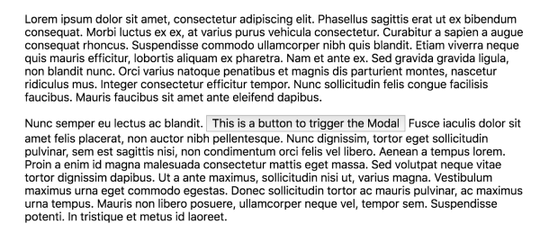
Great, now that we know the button is rendering as expected we can extract it into its own ModalTrigger component...
const ModalTrigger = () => <button>This is a button to trigger the Modal</button>;... and look to consume our new ModalTrigger in place of where it originally sat in the Modal.
class Modal extends Component {
render() {
return (
<ModalTrigger />
);
}
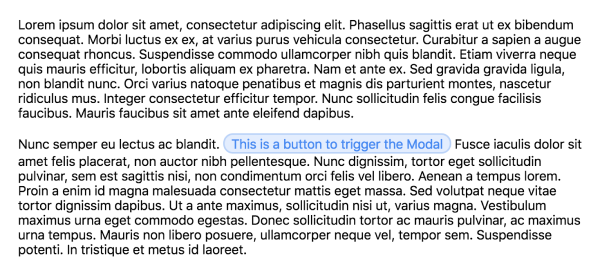
}While we're at it we might as well add some nicer styling to our trigger. Give the <button> element a className of c-btn.
const ModalTrigger = () => <button className="c-btn">This is a button to trigger the Modal</button>;Using that class, we'll create a nice blue, rounded button with some padding around it.
.c-btn {
  padding: .1em .5em;
  color: #4285f4;
  background: #e2edff;
  border: 2px solid #bad2fa;
  border-radius: 1em;
  cursor: pointer;
  transition: background .15s ease-out;

  &:hover {
    background: #cbddfb;
  }

  &:focus {
    outline: 0;
    box-shadow: 0 0 4px currentColor;
  }
}
We can take our trigger button a step further by passing it's text via a React prop for our users to provide. Wherever in your <App /> that you're consuming the <Modal />, provide a new triggerText prop. It's a personal preference, but in this case I'll group my props in an object and use the spread operator to pass them through. This improves readability with the Modal being potentially inline with regular text content.
const modalProps = {
  triggerText: 'This is a button to trigger the Modal'
};

<Modal {...modalProps} />
Afterwards, we can destructure the prop in Modal and pass it down to the ModalTrigger. Again, we don't necessarily have to destructure our props, but once you have a few exposed in your component it helps with readability and speed.
class Modal extends Component {
  render() {
    const { triggerText } = this.props;
    return (
      <ModalTrigger text={triggerText} />
    );
  }
}
We can then pass that into the <button> element of our ModalTrigger.
const ModalTrigger = ({ text }) => <button className="c-btn">{text}</button>;Now that we have our trigger button's text rendering from a value the user can pass through, we can duplicate this same idea for the Modal itself. Create a new component named ModalContent.
const ModalContent = () => {
  return (
    <div>Modal content to go here</div>
  );
}
Instead of the div, we'll start structuring out our content area.
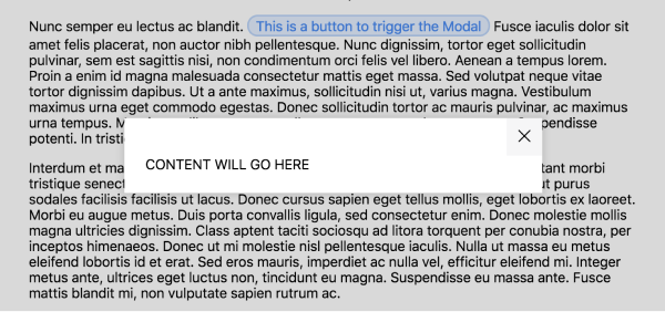
<aside className="c-modal-cover">
  <div className="c-modal">
    <button className="c-modal__close">
      <span className="u-hide-visually">Close</span>
      <svg className="c-modal__close-icon" viewBox="0 0 40 40"><path d="M 10,10 L 30,30 M 30,10 L 10,30"></path></svg>
    </button>
    <div className="c-modal__body">
      CONTENT WILL GO HERE
    </div>
  </div>
</aside>
Breaking that down, c-modal-cover will act as our darkened backdrop on larger breakpoints to fade out the rest of the content and focus the user's attention on the Modal area (c-modal), which will be centred into the middle of the screen on larger browsers as it will have a maximum width. On smaller devices however, c-modal will bleed to the edges of the screen to better utilise the limited real estate.
We can then style this up in CSS to give the desired effect of the content area sitting over the top of a backdrop thanks so a combination of positioning and z-index. I won't go over the styles in too much detail, but if you're interested in this further, Sky's Toolkit Modal CSS is fully documented for you to read in your own time.
.c-modal-cover {
  position: fixed;
  top: 0;
  left: 0;
  width: 100%;
  height: 100%;
  z-index: 10; // This must be at a higher index to the rest of your page content
  transform: translateZ(0);
  background-color: rgba(#000, 0.15);
}

.c-modal {
  position: fixed;
  top: 0;
  left: 0;
  width: 100%;
  height: 100%;
  padding: 2.5em 1.5em 1.5em 1.5em;
  background-color: #FFFFFF;
  box-shadow: 0 0 10px 3px rgba(0, 0, 0, 0.1);
  overflow-y: auto;
  -webkit-overflow-scrolling: touch;

  @media screen and (min-width: 500px) {
    left: 50%;
    top: 50%;
    height: auto;
    transform: translate(-50%, -50%);
    max-width: 30em;
    max-height: calc(100% - 1em);
  }
}
At this point you may be asking why we can't style the backdrop through a pseudo element. Don't worry, I'll explain later when we get to the requirement of "Clicking outside the Modal will close it".
Moving on, we then create an area for our content to go, above which we add our close button.
.c-modal__close {
  position: absolute;
  top: 0;
  right: 0;
  padding: .5em;
  line-height: 1;
  background: #f6f6f7;
  border: 0;
  box-shadow: 0;
  cursor: pointer;
}

.c-modal__close-icon {
  width: 25px;
  height: 25px;
  fill: transparent;
  stroke: black;
  stroke-linecap: round;
  stroke-width: 2;
}

.c-modal__body {
  padding-top: .25em;
}
As the design we've created does not show any text for the close button, we'll hide that visually using a utility class. This ensures that whilst we won't see the close button's text visually, screen readers will still pick up on it. You can read up on this technique in great detail over on Jonathan Snook's blog where he speaks about Hiding Content for Accessibility.
.u-hide-visually {
  border: 0 !important;
  clip: rect(0 0 0 0) !important;
  height: 1px !important;
  margin: -1px !important;
  overflow: hidden !important;
  padding: 0 !important;
  position: absolute !important;
  width: 1px !important;
  white-space: nowrap !important;
}
To view our progress so far, render the ModalContent within our Modal, just underneath where we reference ModalTrigger.
return (
  <ModalTrigger text={triggerText} />
  <ModalContent />
);
Oops! If you tried that you'll notice it's blowing up. That's because in JSX you must always return one element, rather than the two we have here in the form of ModalTrigger and ModalContent.
Utilising React Fragments
To get around this a lot of developers settled with wrapping adjacent elements in a <div> tag, but adding extra markup to compensate for tech problems always leaves a sour taste in my mouth. Fortunately, in React 16.2 you have access to Fragments. This is a core React component that you can use to wrap adjacent JSX elements and circumvent the one rendered element limitation, whilst getting rid of the <div> soup in your DOM. Yey!
To use the fragment you can either reference React.Fragment directly, or preferably, destruct Fragment from your React import similar to how I mentioned before when referencing React.Component.
// Option 1
import React from 'react';
<React.Fragment></React.Fragment>

// Option 2
import React, { Fragment } from 'react';
<Fragment></Fragment>
We can then use our Fragment to return both our ModalTrigger and ModalContent.
return (
  <Fragment>
    <ModalTrigger text={triggerText} />
    <ModalContent />
  </Fragment>
);
Once you've returned the Fragment, take a look in your browser and it should look something like this.
The magic of React Portals
Whilst that looks great, if we take a look at our DOM you'll notice we're violating one of our accessibility requirements.
❌ When rendered, the Modal is appended to the end of
document.body.
Before the addition of React Portals, it was incredibly difficult to bubble up to the DOM and render an element outside of where it's being consumed. This is due to the way you interact with React's Virtual DOM, rather than the browser DOM. Thankfully, React 16 makes this a breeze thanks to React Portals.
To utilise them we can interact with the createPortal method from ReactDOM which takes two arguments. The first is the React component we want to render (our Modal content area), and the second is the DOM node we want to attach this to. For us, that'll be the document.body.
Go ahead and update our ModalContent based on that.
const ModalContent = () => {
  return ReactDOM.createPortal(
    <aside className="c-modal-cover">
      <div className="c-modal">
        <button className="c-modal__close" aria-label="Close Modal">
          <span className="u-hide-visually">Close</span>
          <svg className="c-modal__close-icon" viewBox="0 0 40 40"><path d="M 10,10 L 30,30 M 30,10 L 10,30"></path></svg>
        </button>
        <div className="c-modal__body">
          CONTENT WILL GO HERE
        </div>
      </div>
    </aside>,
    document.body
  );
}
Now if we take a look at the rendered HTML you'll see that the ModalContent is rendered at the end of the document.body rather than wherever it is consumed.
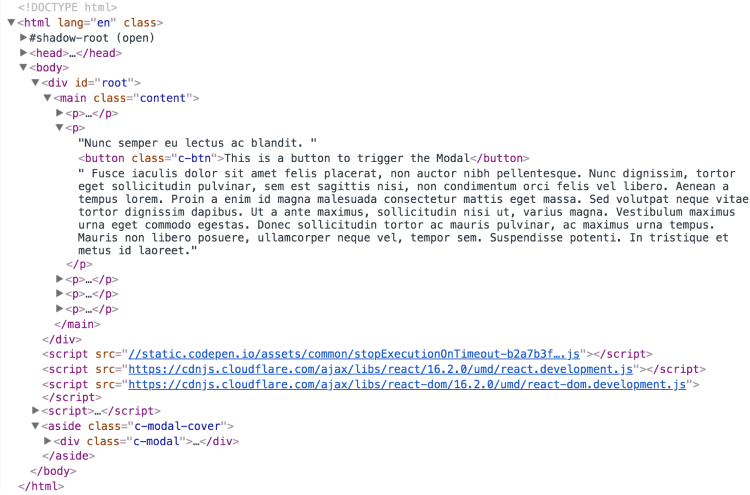
✅ When rendered, the Modal is appended to the end of
document.body.
Setting up a stateful Modal
Now that the Modal is rendered to the bottom of the body element, we need to give it some logic so that it knows when to be displayed to the user. Thinking about the experience we want to create for our users, we only want the component to be displayed when the user has clicked the trigger button. Until then, it should be hidden. We can tackle this by creating a stateful React component.
As the name might suggest, a stateful React component is one which has some form of information stored within it. This information can then be accessed and manipulated in many ways which will trigger some form of re-rendering. An example might be that you have a shopping basket on your ecommerce store and you store the items within the basket using React state. This would then be added to with each item a user adds to their basket, thus re-rendering the basket component with your new list of items.
In our case, we can keep things pretty straight. We want our Modal to store whether or not it should be opened, which will be represented by a boolean named isOpen. Whenever isOpen is set to true will mean the Modal is open, and false for if its closed.
To get started, a stateful component first needs some initial state to tell it how it should be rendered, or in our case, whether it should be rendered. Until recently, this would be represented by using the React.Component class constructor.
class Modal extends Component {
  constructor() {
  }
  // ... etc
}
Then, as our Modal class would be an ES6 subclass of React.Component, we must use the super() function in order to call React.Component's own constructor, which sets up a lot of React things behind the scenes and more importantly, gives us access to this in the context of React.Component.
class Modal extends Component {
  constructor() {
    super();
  }
  // ... etc
}
Finally, as we'd have access to this, we can then create some initial state through this.state, which we would assign to an object with a key-value pair of each piece of state. In our case, that would just be isOpen, with the value of false as we would not want to display to Modal without the trigger button being clicked.
class Modal extends Component {
  constructor() {
    super();
    this.state = {
      isOpen: false
    }
  }
  // ... etc
}
Thankfully, thanks to the power of ES6's Class Properties we can refactor this to be a little simpler, as we will no longer require the constructor.
class Modal extends Component {
  state = { isOpen: false };
  // ... etc
}
Just bare in mind you'll need to make sure your transpiler can handle Class Properties. Babel has support for it.
Now that our Modal's initial state setup, we can look to render our component only when required.
❌ When the Modal is not open, it is not rendered into the DOM.
We can achieve this by wrapping <ModalContent /> in a conditional of our new isOpen state. Within the render method of our Modal component destructure the isOpen state and use that to wrap around our component.
render() {
  const { isOpen } = this.state;
  const { triggerText } = this.props;
  return (
    <Fragment>
      <ModalTrigger text={triggerText} />
      {isOpen &&
        <ModalContent />
      }
    </Fragment>
  );
}
As the initial state of isOpen is set to false, our ModalContent will no longer render in the DOM. Great, but until we setup our click events for the ModalTrigger, the ModalContent is permenantly hidden.
Opening the Modal
Create a new method on the Modal component named onOpen. We'll use React's setState method to update isOpen to true, which in turn will render our ModalContent once called based on what we just did above.
onOpen = () => {
  this.setState({ isOpen: true });
};
We'll pass this down to our ModalTrigger so that we can set it up to fire when the user clicks on our trigger button.
<ModalTrigger
  onOpen={this.onOpen}
  text={triggerText}
/>
In order to do that, we'll also need to attach the prop to the onClick handler of the button.
const ModalTrigger = ({
  onOpen,
  text
}) => <button className="c-btn" onClick={onOpen}>{text}</button>;
Once saved, click on your ModalTrigger in the browser and you should see ModalContent rendered as expected.
Closing the Modal
To finish off our component's state we need to provide the ability to set isOpen back to false when the user clicks on the close button from ModalContent.
Back within our Modal component, duplicate our onOpen method and name it onClose. This time though, we'll set the state to false.
onClose = () => {
  this.setState({ isOpen: false });
};
Next, pass that down to ModalContent.
<ModalContent
  onClose={this.onClose}
/>
Then within ModalContent, pass the prop through...
const ModalContent = ({
  onClose
}) => {
... and attach it to the close button's onClick handler, similar to what we did for our trigger and onOpen prop.
<button className="c-modal__close" aria-label="Close Modal" onClick={onClose}>Test that out in your browser and you should have a component that:
- does not render
ModalContenton initial page load; - does not render
ModalContentwhenModalTriggeris clicked; - and if already opened, removes
ModalContentfrom the DOM when the close button is clicked.
✅ When the Modal is not open, it is not rendered into the DOM.
Next steps
We've managed to cover a lot in a short space of time, let's take a break there to collect what we've learned. So far we've created a React Modal that only renders when the user clicks on the trigger button. When opened, it is placed at the bottom of the document.body, and finally you are able to close the Modal through it's close button.
In the next part, we'll take a look at WAI ARIA attributes and focus management where we'll get into the nitty gritty of what it takes to make your Modal component fully accessible for all users.
In the mean time, I'd urge you to take some of the newer features of React for a spin in your own apps and let me know how you get on.
Until next time